A new look!

You may have noticed my blog looks a little different than it used to - and you'd be right! I've been working on refreshing the 'look' of my knitting design business, to match my current taste and design style a bit better. I do hope you like it. :)

I went through quite a lengthy process of collecting images to use as inspiration, and reading up on typography + logo design + branding in general. Yes, it would all have been much faster if I'd hired a pro to sort it out for me, but I was curious to learn about these areas, and I'm a bit of a control freak when it comes to design, especially for an important project like this.

My 'inspiration board'

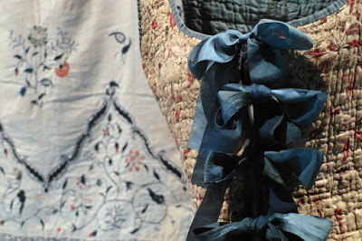
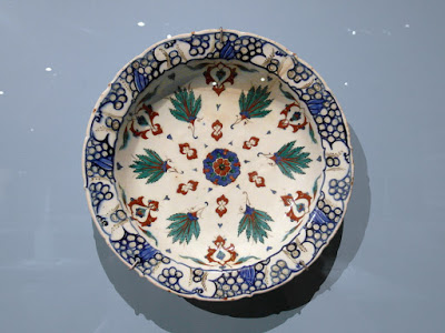
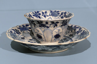
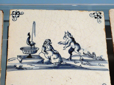
I wanted a light, bright, beautiful feel, with a handmade, playful side to it. I also really wanted to keep yellow in the mix, since that colour means happiness to me. My 'inspiration board' features swirling shapes, yellows and golds, details from Klimt paintings, music in the form of a violin scroll, and nature in the form of trees, flowers, and bees.

I love any excuse to get out our art supplies, and I had a lot of fun drawing and tweaking my new logo. Because I'm a massive nerd, the starting point for my hand-lettering style was an 18th-century title page for a book of keyboard music by J.S. Bach:

Here's the the finished lettering for my logo, together with a circle of purl stitches in light, warm yellows:

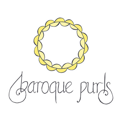
Did you know the Baroque period in music (when my faves Bach and Handel and Monteverdi were composing) gets its name from 'baroque' shaped pearls? This type of pearl is irregular and bumpy, and the analogy to music was originally meant as an insult, much like 'Impressionism' in painting. My yellow circle of purls is my attempt at a pun - it's a baroque pearl made of purls.

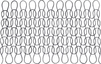
I also sketched a loose, flowy texture based on the structure of plain stockinette or garter stitch, which I'll use as a background or wherever it's needed. I made a little stop-motion video of myself inking over the pencil sketch, just for fun...

(Click to play gif!)

I'm hoping these elements, along with my new colour palette and selection of fonts, will be versatile enough for all of my blog, social media, newsletter, and pattern layout needs. I'll be updating all of these over the next while! And most exciting of all, I'm going to be working on a new website to house a pattern gallery, with tutorials and everything else all in one place.


In case you're curious, this book is one of the main resources I used for this whole process. It's been fun, but I admit I'm impatient to get back to focusing on designing!

WARMing up

Have you heard about the WARM project? It's a community textile art project to reflect on climate change and sustainability, which will take the form of two giant pictures made up of small knitted parts, to be installed in the Ballarat Fine Art Gallery this September. You can read about the inspiration for the project here.

My contribution is a batch of knitted gum leaves (Ravelry project link). I've made six small ones so far, which I'll put in the post today. If I have time, I'd like to make another batch of leaves.

I found some fallen leaves and flowers under the gum trees at our train station today, very conveniently for my photos!

If you'd like to knit something to contribute to WARM, you can find the all of the patterns (devised by Georgie Nicholson) here on Ravelry - you can make different kinds of native flowers, or wind turbines, or simple lace squares for example. All items need to be made from 100% wool yarn, and using stash yarn is encouraged. Contributions are due by the 12th of August.

Indigo and cobalt

I have a pretty-pictures post for you today! I visited the NGV on Sunday after choir, and saw an exhibition that's been on my to-see list for a while.

Blue: Alchemy of a Colour definitely lived up to my textile/dye geek expectations, once my eyes adjusted to the dim lighting. I really enjoyed seeing all the different textile decoration techniques from various places and time periods - and it was so much easier to see the details and differences in real life. Being able to see the texture of the fabric from various angles makes such a difference. That said, I hope you find my photos interesting! ;)

Most of the fabrics below are dyed with indigo. This beautiful kimono and wall hanging were decorated using resist techniques, which you can read about here: Resist-Dyed Textiles.

And here are examples of ikat fabric, where the threads are resist-dyed in a pattern prior to weaving. You can find out about how it's made in this photo gallery: Making Ikat Cloth.

The 'rag kimono' below is an example of boro patchwork, a traditional Japanese form of visible mending. You can see the parallel lines of running stitch holding the layers together in the close-up photo.

You can read more about traditional boro and sashiko embroidery here: The Japanese Art of Sashiko Stitching; and you can see examples of modern sashiko-inspired visible mending here: Three Easy Ways to Mend Fabric, Inspire by Japanese Textiles.

This quilted bodice with indigo-dyed silk ribbons and 18thC embroidered bedspread are just too pretty, especially with the depth of colour in the ribbons. I recognised the bedspread from last year's 'Exquisite Threads' embroidery exhibition...

Lastly, I had a look at the ceramics. This article on the exhibition describes the use of cobalt in ceramic decoration, which goes back over 1,000 years. The 18thC Delft tiles were especially cute! I've included by favourite below...

If you're curious about indigo dyeing, here are a couple of videos I found interesting. The first is about cloth-dyeing in India, and the second (specially for my fellow knitters) is about dyeing yarn. I must get some real indigo yarn to play with!

New pattern: Deco City

I'm back in Melbourne, and hiding indoors from the heat! A mini-heatwave has arrived to welcome me back. It always takes me a little while to readjust to the time difference too, even though it's only two hours.

One good thing about being back from holiday (other than hanging out with Willie and Ju again) is finally getting my hands on Pom Pom Quarterly's Winter issue and seeing my name in print for the first time as a designer. It's a pretty amazing feeling!

My shawl is called 'Deco City' after New Zealand's capital of Art Deco, Napier. My newly-wed brother lives there with his family, and it's a cool place to visit! I particularly love the art gallery by the waterfront:

Photo by Dad

Deco City is a crescent-shaped shawl with an all-over lace pattern inspired by Art Deco design. It's quite simple to knit, with purled ‘rest’ rows on every wrong-side row and stitch markers to indicate where the middle section begins and ends.

Features:

  • curved crescent shape with elegant drape

  • all-over geometric lace pattern

  • top-down construction, beginning with a garter tab cast-on

  • two sizes, photos show larger size

  • requires 318 - 477 yards of sport-weight yarn

  • suitable for solid or semi-solid colourways

  • written pattern only (for greater simplicity in this case)

The lovely deep blue yarn I used is Road to China Light from The Fibre Company, a very soft blend of baby alpaca, silk, cashmere, and camel. I used three skeins for the larger size, but for the smaller you only need two.

Photo by Pom Pom Quarterly

You can buy a digital copy of the magazine (and see all the other designs!) on Ravelry or on Pom Pom Quarterly's site, and you can buy a print copy directly from Pom Pom or from their retailers.

Free pattern: Droste Effect

I have a hat pattern in the latest issue of Knitty! This is really exciting for me, as I first got lured into knitting as a hobby by the fun, free patterns in Knitty. This is Droste Effect, a hat covered in cables inspired by the structure of stockinette stitch: 


Features:
  • all-over cable pattern designed to look like stockinette stitch
  • crown decreases are integrated into the cable pattern
  • two sizes: adult small + large
  • a one-skein project: requires up to 185 yards of DK-weight yarn
  • full charted and written instructions
  • available for free!

The yarns I chose are two NZ yarns which have excellent stitch definition, perfect for knitting cables. The brown hat (size L) was knit using 2 balls of Skeinz Silver Lining in 'Clifton Stone', and the sea-green hat (size S) was knit using 1 skein of Vintage Purls Max in 'Abel Tasman'.

The name 'Droste Effect' is taken from the visual effect of a picture-within-a-picture, because the hat's cables represent a large-scale stockinette stitch (it's a knitting pattern that looks like knitting). Tins of Droste brand cocoa famously feature a nurse holding a tray with a cup and the same tin on it:


The photos were taken by Jos, my dad, when I was visiting Whakatane last. We went to one of my old childhood haunts - the playground by the river at The Heads. Bay of Plenty locals might recognise the rocks and Moutohorā/Whale Island in the background...


 We also played around with the picture-within-a-picture idea... :)


Droste Effect is available as a free pattern here at Knitty.com.
Its Ravelry page is here.